Project Summary
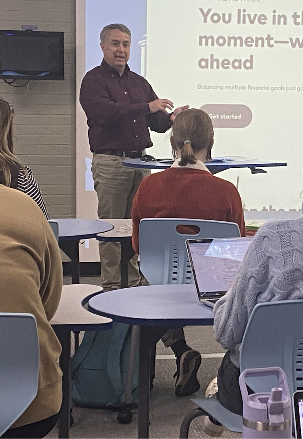
I listened carefully as Steven Schang, Senior User Researcher at Vanguard, approached our class wanting to better meet the needs of beginning investors using Vanguard’s robo-advisor product. I collaboratively led usability testing, persona development and a card sort that revealed many times over that users were confused most of all by the investment terminology. I narrowed in on this core user need of access to redesign the client dashboard with a new navigation structure, tooltips, plain language, and a dashboard tour — and preliminary user testing shows that it was a success in increasing comprehension.
Design Context
Problem Statement
I took detailed notes and asked follow-up questions when Vanguard’s Senior User Researcher approached our class with his problem: learning more about early career or first-time investors’ experience with Vanguard’s robo-advisor product, Digital Advisor. I saw that conversation as a way to better understand the business stakeholder requirements for the product. Out of this conversation emerged our central research question that guided the process.
My Role

UX generalist
My value-add: Staying close to the user research to better define what question I’m trying to solve
The Research Question
How might we create a digital experience that increases confidence and engagement for beginning investors to sign up for and benefit from accounts/services?

Skills Developed
User Research
usability testing, audience analysis chart, listening session, persona development, card sort
UX Design
Pencil and Figma wireframes, mid and high fidelity prototypes, style guide
UX Software Tools
pencil and Figma wireframes, mid and high fidelity prototypes, AI Prompting (using 5+ generative AI engines)
Content Strategy
content hierarchy chart, user flows
The Process
Usability Testing
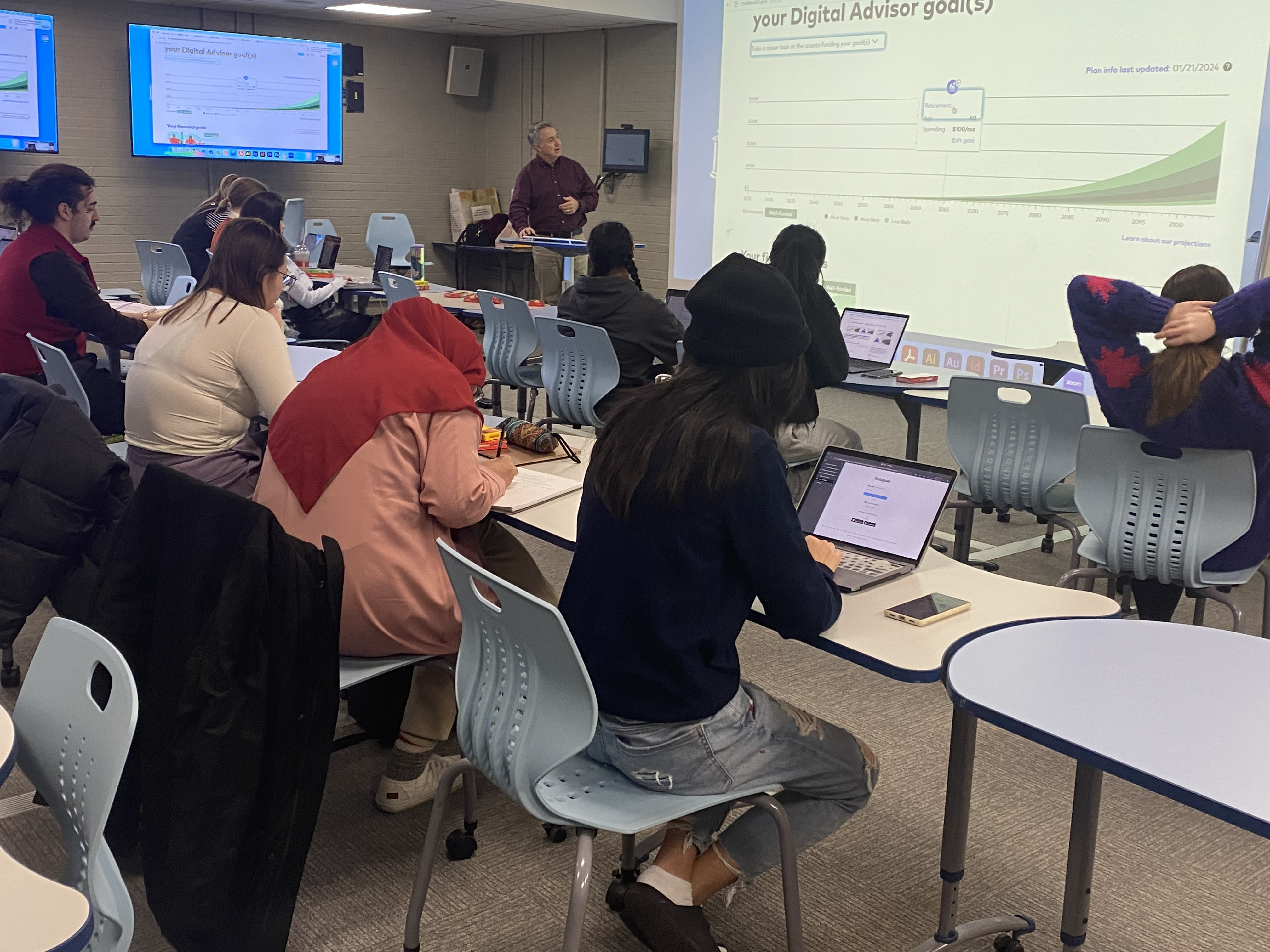
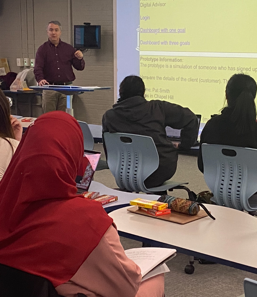
Working collaboratively on a team of 6 graduate students to design and conduct a usability test of Vanguard’s robo-advisor webpage and prototype of client dashboard (provided by Vanguard). Confusion was a key pain point amongst users, resulting from issues with the main graph on the dashboard, financial terminology/jargon and and other inconsistencies (Slide 8).
Notable Involvement: Drafted consent form and initial draft of test script utilizing AI, prepared content for methodology and participant demographic slides
Other classmates’ presentations on their usability tests confirmed a similar theme of confusion with the graph and jargon.
Persona Development
- Audience analysis chart: I worked in a team of three to develop an overview or “umbrella” audience chart that described the characteristics that fit our larger, target user base of beginning investors. Notably, I conducted external research to the learn the habits of early investors.
- User Listening Session: I conducted a half-hour long listening session with one user that met the criteria from our audience analysis chart. I showed up with no script and listened to the user talk about his fears with money growing up and why being in control of his money was important to him.
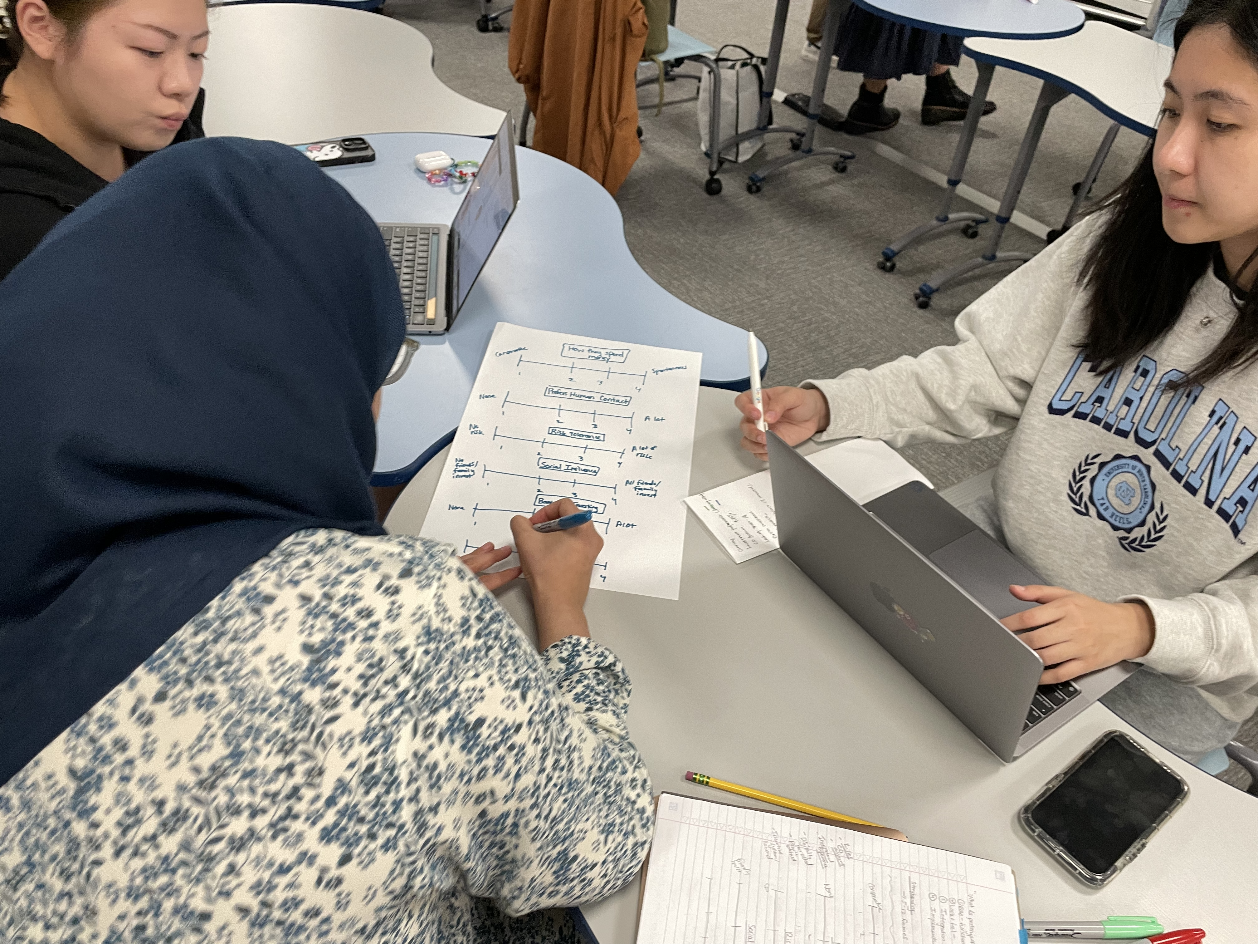
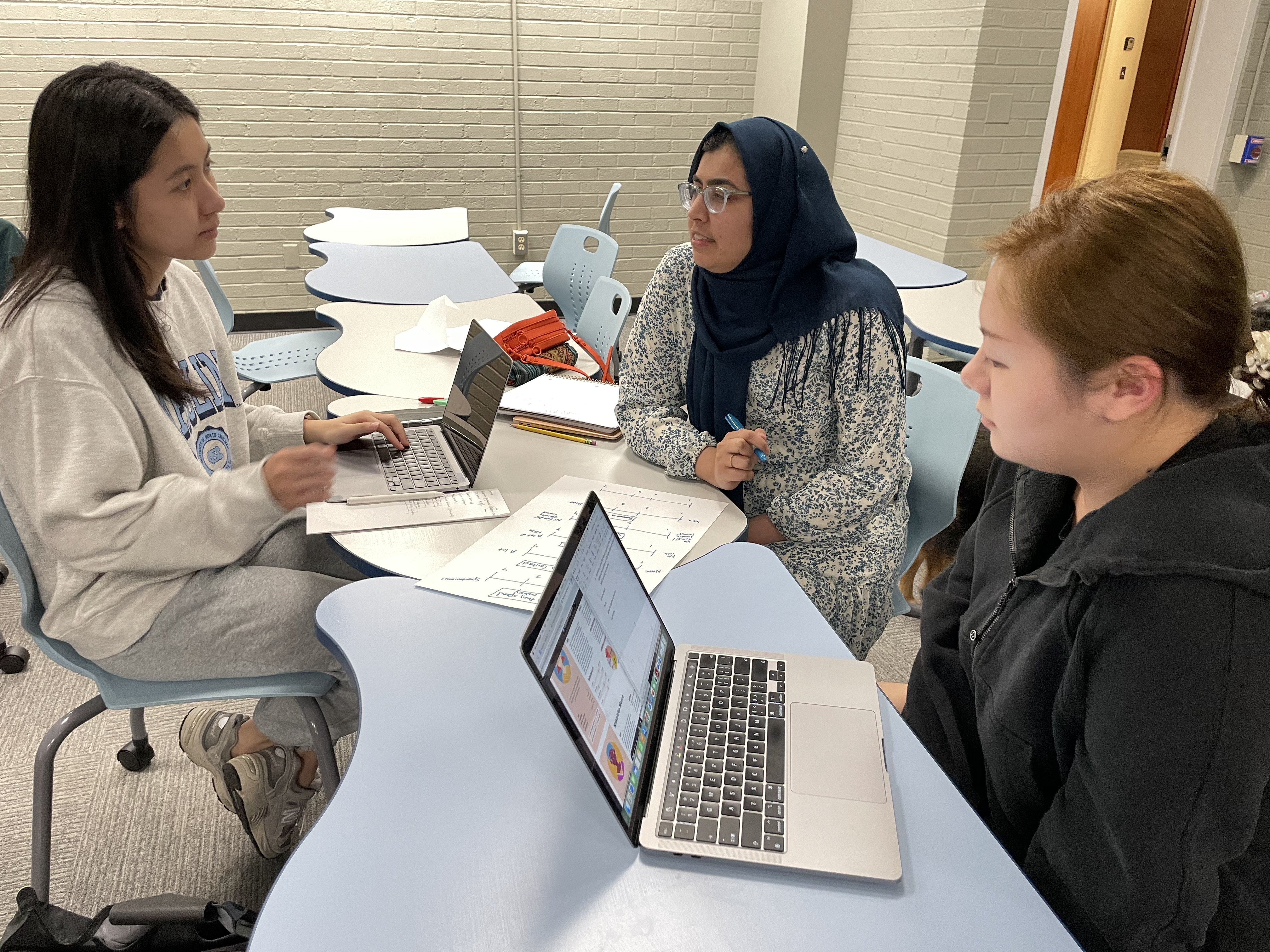
- Research-Based Persona Development: We regrouped as a team to map common patterns and themes that emerged from our listening sessions with users. We used reasoning-based behavioral segmentation to create rank users on 6 behavior categories (spending habits, prefers human contact, risk tolerance, social influence, barriers of investing, trust of AI). 3 personas archetypes emerged
- Developing a Persona Profile: I used empathy mapping to develop the persona profile of Amy, a risk-averse young person seeking to invest after landing her first job out of college.
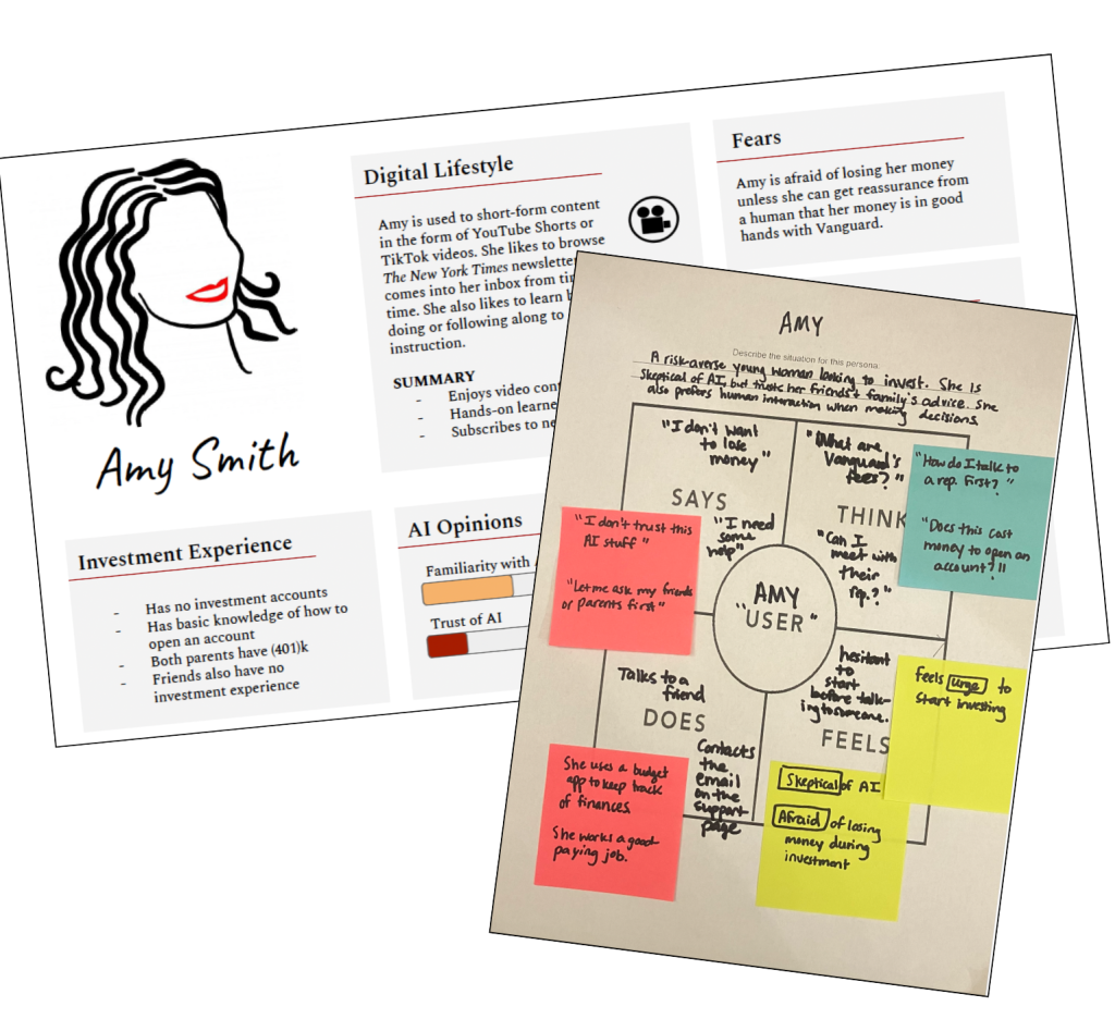
“Assumptions are pernicious. Going deeper than assumptions and opinions is what’s called empathy.” –UX thought leader, Indi Young
I liked and followed Indi Young’s advice to exclude “bias” factors like age, gender, race, education level, etc. Instead, I focused on Amy’s digital communication styles and preferences. See my reflections on this step here.
Content Structure & User Flows
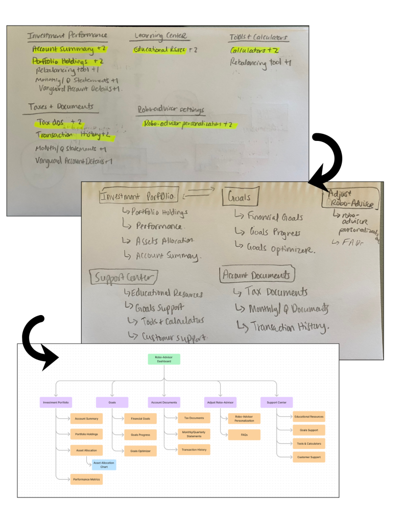
Open Pilot Card Sort– I conducted an open card sort using a list of ~20 assets I selected after extensive research using AI and looking at the current Vanguard robo-advisor dashboard.
Hybrid Card Sort– Using the research from this card sort, I developed a hybrid card sort for 8 participants to take. I then analyzed the card sort results to come up with a user-informed content structure.
Content Hierarchy Chart– I spent extended time analyzing the card sort results to find pattern in users’ thinking about investment assets. I learned that there was still some confusion around what terms meant, even as I included definitions with the cards. I developed a new navigation content structure that simplified and consolidated the assets while avoiding industry jargon.
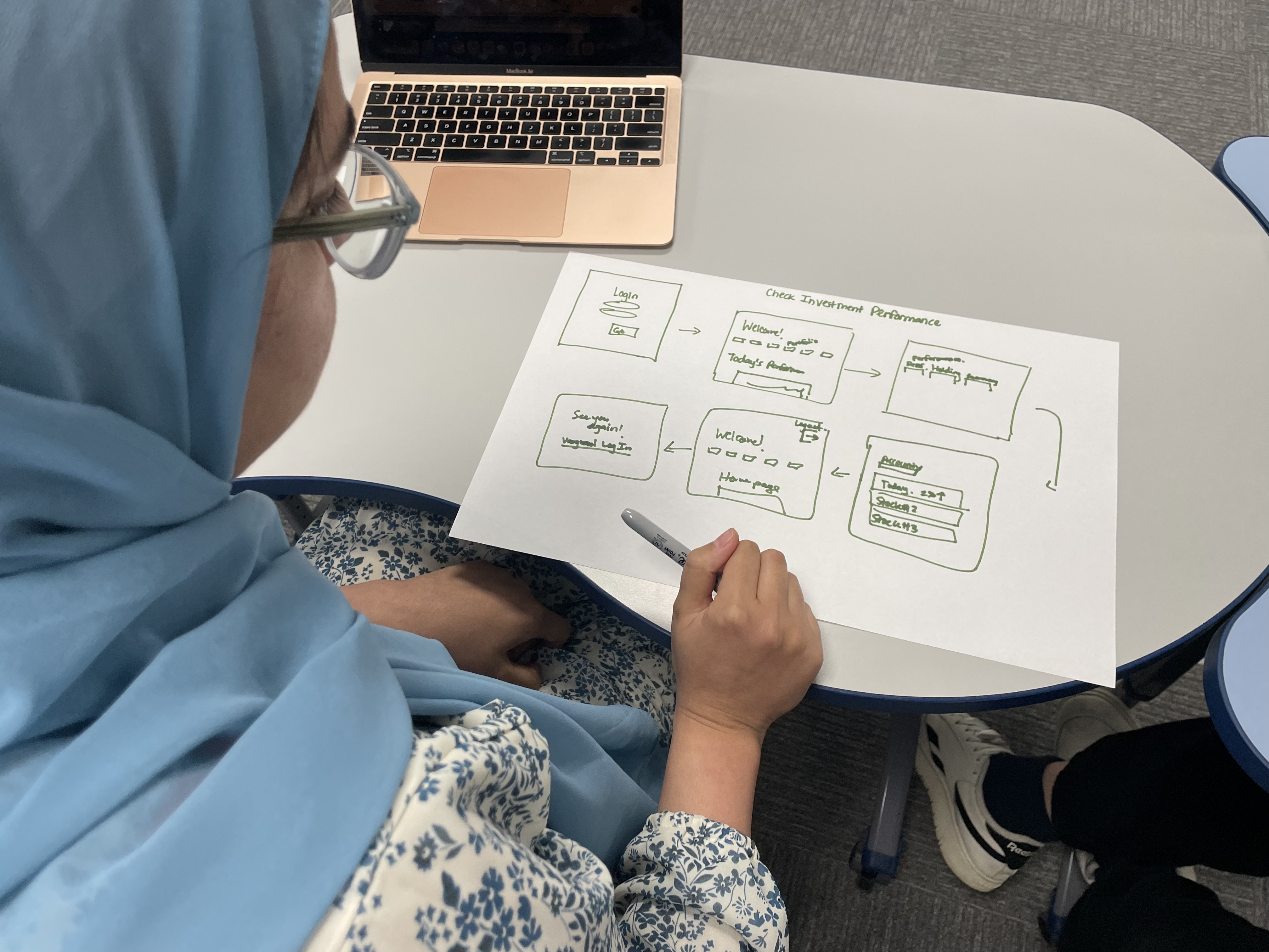
User Flows– I then developed three user flows of common tasks users could expect to perform using the new content structure. Two of these tasks were checking on investment performance and downloading tax documents.


Sharpening The Research Question
At this stage in the process, I took a step back and looked at all of the research. From the usability testing through the card sort, I noticed a thread of users not fully grasping many of the investment terminology. For example, one card sort participant in the pilot sort created a category of “checkings/savings” reflecting their experience using bank accounts.
Sharpening the research question, I realized that the product needed to be teach and tell at the same time— making industry-specific investment language accessible and familiar to beginning investors.
How do we remove barriers to make investment dashboards feel familiar to new investors? How do we build learning into the platform, so it teaches as it tells?
Wireframes
I focused on access, understanding and comprehension in wireframing. Beginning with the login page, I strove to create a welcoming and friendly experience that met the users where they were.
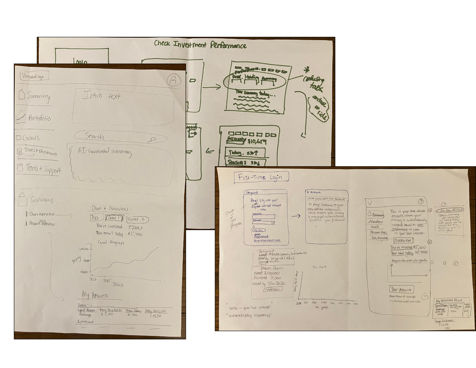
The Product
High Fidelity Prototype
Notable Features
- Redefined navigation structure
- New dashboard tour
- Simplified language and new labels for graph
- “Browse & scroll” design
Vanguard Style Guide
- I used the links that Steve Schang sent to us for inspiration in designing the style guide.
- I did color matches for the greens and yellows that appeared on the charts from those pages to create a color palette for visual/graph elements.
- Since buttons and links would be essential to the functionality, I focused on those UI elements for designing— again sticking with the provided pages for inspiration in order to ensure consistency and professionalism in the visual design.

User Testing- Study Design
I designed a user research test on UserTesting.com to test the effectiveness of the new prototype at increasing understanding of an investment dashboard and terminology. In order to effectively engage with the desired target audience and test specifically comprehension of the dashboard, I was intentional designing a focused study by:
- Target Audience Filters: Exclude retired people or users who do not have entry-level roles
- Screener Question: Only participants who checked yes could take the test: “This research is intended to learn more about first-time investors’ experiences using an investment dashboard. Do you consider yourself a person with little to no experience in investing?”
- Targeted Questions to Test Comprehension: Questions like ” Go to the main “My Dashboard” page and navigate to the “Overview” section. Please explain what you think the graph is showing you ” tested understanding.
- Rating Scale Questions: Questions like “How helpful was the dashboard tour option when you first logged in? [5-point Rating scale: Not at all helpful to Very helpful]” allowed to measure impact quantitatively.
- Follow-up Explanatory Questions: Asking “Please explain more about why you chose this. Feel free to elaborate on preferences, likes and dislikes, and give examples. [Verbal response]” after each enriched the data with context.
User Testing- Results
Results:
While there are more improvements to be made, the test results revealed that the dashboard was “on the friendlier side” and “pleasant.” All users ranked the navigation menu as “very clear” and the overall experience “easy or very easy.” The dashboard tour was considered too minimalist to be helpful, since it had only one general pop-up. Given the appreciative response that the option for an informative tour exists and can be closed out at will, expanding the dashboard tour would be a great next phase to this project.
“Everything is laid out very neatly and very effectively. . . And me not knowing much or anything about investing, I think it would be very useful to a new user [may be less so for someone who’s experienced] but for a new investor, it’s a good layout and would be very useful.”
-User Test Participant
User Testing Changes & Reflection
Reflection on User Testing Experience
From the user testing experience, I learned that your results are only as good as the quality of your test. I felt satisfied with the quality of results I got back because I asked targeted questions about the problem I was trying to solve for— dashboard comprehension. UserTesting.com made it easy to add rating scales, and I took advantage of that. I also was thoughtful in the target audience filters, so I could get responses from the correct target audience. I avoided “bias” factors like age and income, instead only filtering out advanced career professionals and retired people as well as adding a screener question. All of these returned me real data of value with regards to if I was able to successfully remove barriers in the redesign that initially caused confusion during the first usability test.
Based on the user testing results, I made minor changes to the “Your Investment Accounts” section— I added the account balance total amount under its section heading and since no user noticed or clicked on the circular yellow tooltips, I instead added a more visible “What’s this?” tooltip under the word. In the next round of iteration, I would most definitely expand the dashboard tour to be more comprehensive and build the graphs for all three goal tabs as the users were interested in both of these.

Lessons Learned
I found going through this entire process extremely rewarding and enriching in empathizing with the user. If I could do it again, I would spend more time on the initial usability test, because it guided so much of the direction I took in the redesign process. I would also further elaborate on the dashboard tour, so it is complete and can be tested for increased comprehension more thoroughly.
Attributions
- Hijabi female icon: Hijab icons created by Freepik – Flaticon
- Lightbulb icon: Creative thinking icons created by Freepik – Flaticon